This week I'll be talking about exactly that: how to quickly and easily compile your audio clips together and add images to make them clear, informative, and interesting. This is something that most people don't normally think about until the moment they come to do it, which can lead to a lot of issues and a few frantic moments when you're trying to get your assignment submitted in time.
Designing a Cue Card
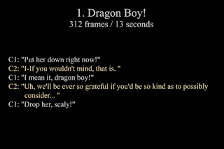
So let's get started! The first thing we need to do after finding our audio and narrowing down the selection to about 3-6 clips is to design some cue cards to go along with them. There's no official AM structure for creating these, but here is a layout that, we found, works really well in making your dialogue clear and legible.

As you can see, we start with a number and a title to make it easy to reference back to when you're working on your clips. It also makes it easier for the students commenting on your PRs as well as for your mentor to tell you which clips are their favorites or which ones might not work so well.
Next on our cue cards we have the frame limit and timeframe of the audio clip. This is important to have because it helps you to know exactly how long your clip is, both in frame numbers and seconds. If you're not sure how long your clips are in frames, you can easily check by opening your clip in Quicktime, clicking on the time counter, and changing it from seconds to frames. You may also want to export the clips using the AM standardization methods first to make sure the audio is set to 24fps.
We've now we've arrived at the meat and potatoes of our cue cards, the dialogue! This is the most important part of the cards because it tells us who says which lines, and also exactly what they said. When naming your characters, it's a good idea to name them something very simple, like char1 & char2 (Char being short for character), or man1, man2 & woman1. It keeps it easy to read and easy to understand. You can give the characters proper names as well if you like, especially if their names are mentioned in the dialogue, but names are something you can come up with once you've settled on your final clip.
Now for the dialogue itself, it's important to write it down exactly as they say it. If you're having trouble understanding a word or phrase, ask a friend or family member to take a listen. Or if you feel like digging around the internet, you could try googling the quote or movie title and see if anyone has written a transcript already. Once you have your lines written out, it's time to pick colors for the lines. It's generally a good idea to change the color for one of the charactera so that both speakers' lines stand apart from each other. Just make sure you don't change it to something really contrasting that will make it hard to read. Even a slight hue change from white to off white is often enough to get a good contrast.
Using Splashup to Create the Cue Cards
You may be thinking: "This is all well and good, but you forgot that I don't have a program that will let me do this!". You can use just about any image editing software to create them, such as Photoshop, AfterEffects, or even MSPaint. If for some reason you don't have anything like that, there is an online program called Splashup that will let you make these title cards quickly and easily! You don't even need to download it. Just go to http://www.splashup.com/ , click on the large image that says "Jump Right In", and start creating your cue cards!
To make this step easier, Beau and I have made a template image with placeholders for the text, notes on some good font sizes to use, as well as some basic color choices for your dialogue. You can see the full 7200x480 cue card here: Cue Card Template
To use it in Splashup, "hit File > Open Image", go to the "HTTP://" tab, copy/paste the url from the link into the "URL:" box and hit open. Now you'll have a template to help you quickly get your cue cards set up. Just make sure to do all your work on other layers so that you keep the template clear for referencing.

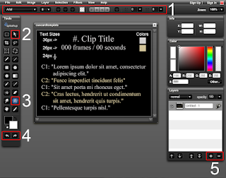
As you can see in the image above, the overall workspace of Splashup is fairly simple. I've numbered and highlighted all the important tools that you need for creating your cue cards:
1) The text tool's interface. When you have the type tool selected, this will appear and allow you to customize the size, font, and color of your text.
2) The move tool is what you'll be using to position your text into place.
3) The text tool. This is the tool you'll be using most to put in your text.
4) Undo and Redo. These two are probably some of the best tools ever invented. If you make a mistake, just undo it!
5) This is the Add and Remove layer buttons. Fairly self explanatory.
There are plenty of other tools to use though, apart from these main ones. For example the Paint Bucket tool is great for filling a layer with black for your cue card's background. Don't be afraid to take a look at all the tools and what they do. Each tool offers a small tooltip that pops up when you hover over it, giving you an idea of what it does, so go ahead and experiment!
Using the template provided earlier, you can see exactly what size we used for each element, as well as the colors, which you can simpy use the eyedropper to match for your own text.
Once you've finished creating your cue cards, it's time to save them out to your hard drive! Go to File > Save Image, make sure you're saving to Desktop, and hit Save in the bottom right corner. You'll get a Image Settings window that gives you the option to choose what kind of file format to save as. You can use JPG, but I find that using PNG gives a much better quality and since you're putting these cue cards into your Quicktime clip and not uploading them straight to AM, you don't have to worry about the JPG only file restriction.
Compiling your Clips for Uploading
Our files ready, it's time to compile them all together for uploading! We'll be doing this in Quicktime using an easy 3-step process:
Step 1: In this step we'll be adding our new cue cards into each of their respective sound clips. The problem most people have is that they tend to import their cue cards in a single frame at a time. And when you have a 300-400 frame audio clip, it takes a long, long time.
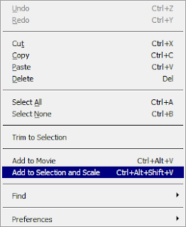
But there is a way to import your cue cards quickly and easily into your audio clip. First, open both your audio clip and cue card in separate QuickTime players. Now that you have those two players open, select the cue card window and hit CTRL+A to select the entire 1 frame timerange, then hit CTRL+C to copy it into your clipboard (Command+A and Command+C on a Mac). With the cue card copied, next we'll select our audio clip window, hit CTRL+A to select the entire time range, and go to "Edit > Add to Selection and Scale". Now your cue card is pasted into the entire length of your audio clip! Easy as pie!

If for some reason your clip has a lot of dialogue and you need two or more cue cards for the one clip, it's still very easy to do. Copy your first cue card like before, but now instead of selecting the entire time range on your audio clip, only select from the first frame up to where the first line of dialogue in the second cue card starts and hit "Edit > Add to Selection and Scale". Then copy your second cue card, go back to your audio clip and hit "i" on the keyboard to set the start point of your selection to where the second cue card starts. Finally, go to the end of the clip and hit the "o" key to set the end point and paste the cue card the same way as before!
Step 2: With all of our separate clips now featuring awesome cue cards, our next step is to add in some nice separators in the audio in the form of a chime or other sound effect to signal the end of one clip and the start of the next. This isn't a mandatory step, but it will definitely help to clarify each audio clip you have, especially if you have some that are fairly similar to each other running back to back.
You'll want to make sure that you use something discrete and subtle for your separator. You don't want to end each clip with a loud obnoxious sound or audio clip that will pull the viewer away from what's important: your dialogue. A small chime, ding, or beep is perfect.
Here are a few good examples that you can use as separators:
Good Clip 1
Good Clip 2
Good Clip 3
And here is an example of what to avoid like the plague:
Bad Clip
Once you have your separators, you'll want to make sure that their volume is equalized to match all of your audio clips. To do that, go check out Beau's awesome post on equalizing audio clips:
Class 4 - Week 6 - Editing Audio
Now that everything is ready to be put together, simply open the sound clip into Quicktime and copy/paste it at the end of each of your dialogue clips.
Step 3: For the final step, compile all of your shots together and export them for upload! This step is very simple. Create a new blank Quicktime player, select your clips in the order you want to have them played, hit CTRL+A to select the entire timeframe of the clips, then select the new player and hit CTRL+V to paste it in. Just make sure that your timeslider in the new player is always at the end so that when you paste your clips in they fit up nicely.
Once all your clips are copied and pasted into the new player, it's just a matter of going into Export and following the AM Standardization Procedure to get your completed audio clip reel ready for upload!
Thank you for taking the time to read my post. I hope it's been helpful, and if you have any questions or suggestions, you're always more than welcome to leave a comment or send us a message on AM.

No comments:
Post a Comment