and is almost as important as the animation itself. Because no matter
how amazing your animation is, if the viewer has trouble understanding
the shot from the camera angle, or can't see what's happening clearly,
then all the work you've done is pretty much wasted.
All of this is also fully applicable to any visual medium, be it
drawings, paintings, photography, or stu poses.
We'll start by taking a look at one of the basics of shot composition,
the Rule of Thirds. This rule is all about the placement of the subject
in the frame. Your first instinct might be that since your character is
the center of attention in your shot, that you should put him in the
center of the screen. It makes sense, right? Oddly enough, it isn't.
Placing your character just off center is actually more visually
compelling than having them dead center. This is where the Rule of
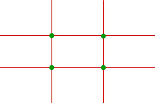
Thirds comes in to play. What you need to do is draw lines on your
frame at every 1/3rd mark, both horizontally and vertically, to divide
the frame into something that looks like a tic-tac-toe grid, which you
can see in the example below.

As you can see, this gives us a set of 4 lines, with 4 points where
they intersect, marked by the green dots. These lines represent the
places in a frame that are most pleasing to the eye, with the dots
being the places where most focus is given. The basic rule of thirds is
that you align your character with one or more of the lines, with the
face, or key prop on one of the green dots. This will give your scene a
much stronger impact and visual flair than planting your character
smack dab in the middle. But, you may wonder, how does something like
this apply to a moving animation? The characters can't stay in the one
spot the entire time. And that's very true. It's impossible to keep a
character in the one third lines all the time. But by using this rule,
you can set up your key moments in the animation to have the maximum
clarity and impact, such as holding up the prized treasure, striking a
valiant pose, or in the case of the Vanilla Walk, not putting Ballie
too far up or too far down in your shot.
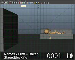
Maya doesn't come with a Rule of Thirds grid, but luckily for us, what
we can do is make use of the Field Chart it does come with and
improvise our grid. Go to your playblast viewport and click the icon
between the grey circle and the green icon with 3 squares. This turns
on the field chart, giving us a grid overlayed onto our shot. What we
can do now is take that grid, and divide it by 3 to find the third
markers. For example, the field chart is 12 units on either side of the
center point, which gives us a total of 24 points. Divide that by 3,
and we now know that the third markers are at units -4 and 4.

Using the Rule of Thirds, you can also roughly plan out your staging,
horizon lines, and overal white space of the scene. Using a basic
layout of one third ground, two thirds sky, or lining key scene objects
to the lines, you can help give your set a more appealing and easy to
read look.
Now there is another, more complex way of planning layout called the
Fibonacci Spiral, Golden Mean, or Divine Ratio. The Fibonacci Spiral is
defined by a mathematical sequence of numbers and shows up throughout
nature regularly, which is interesting in it's own right, but is why we
naturally find it so appealing.

Though it may give more appealing layouts if used properly. the problem
is that this method is much more compex than we need it to be, and is
so close to the Rule of Thirds that you don't really have to bother
with it.
I had planned to include images with examples of how both the Rule of
Thirds and the Fibonacci Spiral worked with images, but I decided that
instead of cramming your page with images, I could instead just suggest
that you go to Google and search for images of them yourselves. This
will give you plenty of great examples of these principles in action.
Just do image searches for Rule of Thirds, Fibonacci Spiral, Golden
Mean, or any of the other variations I mentioned earlier.
So now that we have a better understanding of the basics of
composition, let's talk a little bit about the safe area in a shot,
camera distance, and white space.
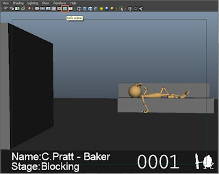
The safe area is the area in your frame that is far enough from the
edge of the frame to read well. If you animate your shots too close to
the edge of the screen, it causes issues with the framing of the shot,
and also stands a chance of being cut off if a television or monitor
crops the image. So by leaving a small border of empty animation space,
you make sure that your animation will always be safe. This isn't to
say that you can't animate to the edge of the screen of course. If you
have a character or any sort of action coming in or going out of frame,
you can definitely do so. But it's important to try and keep all of
your major storytelling action in the safe area. You can turn on a safe
area marker in Maya by going to your playblasting viewport, and
clicking on the green icon with 3 squares. This will show you the safe
area, as defined by a green box around your shot.

Now for camera distance. This tip varies depending on the shot you're
working on, and the mood you're trying to set, but typically, you want
to set up your shot so that the action reads clearly in the frame. If
you have the camera too far, then the viewer can't see what's happening
and you lose interest. If it's too close, the same thing happens. You
want to try and find a happy medium where you can see the entire action
of your shot in frame, while still keeping white space around your
character to give your animation "room to breathe".
Speaking of white space, what is it exactly? Just like on your Stu
poses, white space, or negative space is the area in your shot that
adds contrast to your shot and gives your animation silhouette. And
just like the Stu poses, keeping the white space in your shot from
looking too even or twinned is key to setting up a good animation,
which when you think about it, is exactly what the rule of thirds does!
And that's about all I have for this week. Thank you for taking the time
to read my post. I hope it's been helpful, and as always, if you have
any comments, questions or suggestions, you're more than welcome to
send either Beau or me a message on AM.

No comments:
Post a Comment